Responsive Web Design at #igniteleeds
— 3rd February 2012
Last night I did another pecha kucha style talk this time at an event called Ignite held at Old Broadcasting House in Leeds. The format is basically 20 slides each set to appear for 15 seconds and then auto-advance. As opposed to the BettaKulcha talk I did last April this event has a more tech-heavy slant and so it was more appropriate to talk about something I do for a living.
I chose to talk about Responsive Web Design. The slides are below, along with notes which (as before) are pretty much what I said or meant to say but with most of the umms and errrs removed.
Hello. I'm going to talk about Responsive Web Design. A bit about what it is, where's it’s come from, where's it’s going. Etc.
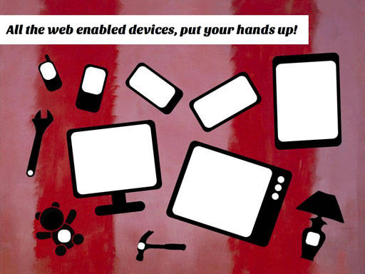
It all starts with the number of devices around at the moment that can connect to the web. Besides PC's there's telephones, tablets, televisions, tools, teddy bears and table lamps. All connecting to the web and all with different screen sizes.
(Not sure whether everyone realised immediately that this was a joke, but I guess if there was any confusion then people's credulity about this makes the point as much as the joke would).
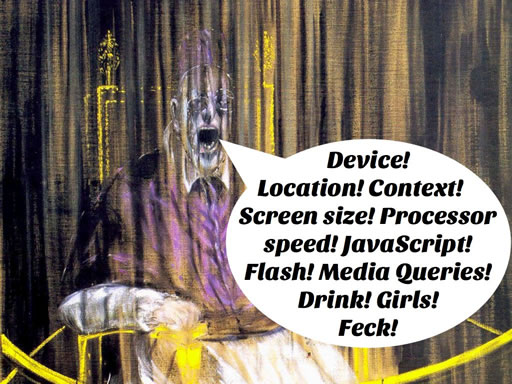
But it’s not only screen size. Each of these devices actually has a whole range of capabilities, things they can do, content they can cope with, which all effect the kind of website you would want to design for them.
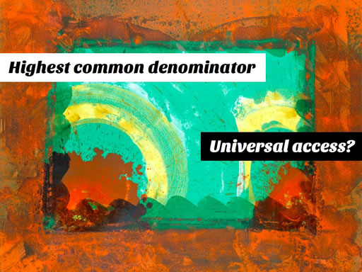
Now traditionally the way you'd deal with this would be to find a kind of highest common denominator. A baseline to design to that you were pretty sure the vast majority of your audience would be able to view perfectly. The trouble is that nowadays the website you’ve designed for a table lamp is going to look pretty basic to someone viewing it on an iPad.
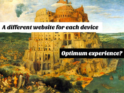
So you want to design a separate website for each device. This way everyone will get an optimum experience whatever device they're using. The trouble with this approach is that it’s a huge amount of work and it’s also a never ending task as new devices enter the market.
So Responsive Web Design attempts offer a solution to this which will give you the "best of both worlds".
(I was surprised at this point how many six year old girls there actually were in the audience. I had thought previously that I'd misjudged this reference!) ;-)
You design one web site but that website responds and adapts to the device which is viewing it to give an optimum experience to each.
There are a number of techniques which have started to emerge to try and do this:
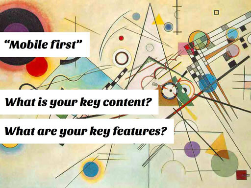
First is the idea that you should build from the bottom up. This means taking the lowest, least capable device that you're targetting and making sure that all your key content and features work on that device.
(One thing I wanted to mention here but which I didn't have time for, is what a good practice this is anyway. A lot of people having tried this describe how it brought a lot of good focus and benefits to their designs for higher level devices too!).
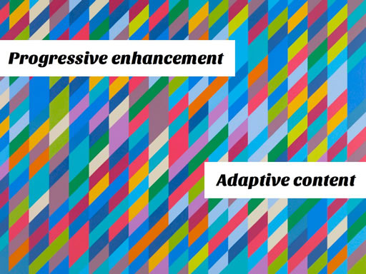
Then building on this solid base we can progressively enhance the design for more capable devices, only giving content and features to those that can cope with them. Also we can adapt the content sending different types of content to different devices, again depending on what they can handle. A good example of this approach is how you wouldn't want a small screen device to have to download a large image which is is never going to be able to make best use of.
(There's a lot of detail I could have gone into here but it seemed inappropriate, I wanted to stick more to a more general point. Hopefully pasting those two phrases on this slide would help anyone Googling for more information later).
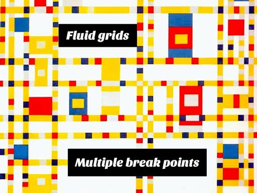
Also by using percentage measurements to lay out out designs and by using media queries to define multiple break points we can create designs which expand and contract and even reflow themselves into whatever space they have available to them.
(Ugh! Again condensing everything that’s covered in Ethan's book into a single slide seems like a disservice but going into more detail seemed like it would open a can of worms which wouldn't have left enough slides to still make the points I wanted to make later on).
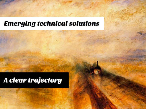
A lot of these techniques are fairly new and there's a number of things which are still being ironed out but I think what’s interesting here is that there seems to be a direction that things are going in which is becoming more clear in terms of web design itself.
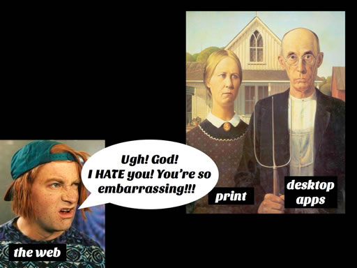
I think as things become mature and evolve they grow away from the things that have influenced them in the past. They become more unique and take on an identity of their own. I think in some ways we can see the web (or perhaps web design) doing this as well. As the web becomes more unique it presents design challenges which are also more unique.
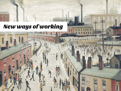
So whilst the tools and techniques that have been taken from those other disciplines are still relevant we now need to augment and add to them. We need to invent new processes and ways of working to meet these challenges we're now being faced with.
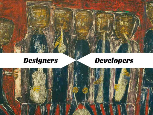
One of the most important ways I think this has to happen is that the traditional roles of Designer and Developer have to come together. In order to make some of these new ways of working a success designers and developers need to work much more in collaboration, making joint decisions based on more of a shared understanding and appreciation of each others work.
Many of these ways of working could have been adopted right from the beginning of the web, but I think previously we’ve be able to get away without embracing them. I think the way the web is changing means that doing that is going to be less viable going forward.
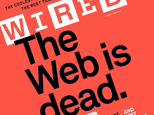
Now you could say this is all irrelevant because native apps easily outstrip websites in terms of providing a great user experience, and I think in many circumstances that’s correct but I also see an interesting parallel.
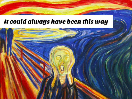
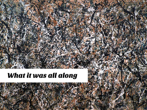
When photography was invented it easily outstripped painting in terms of depicting the real world. Those people who continued painting not only reinvented the medium in reaction to this but by doing so they also rediscovered what painting had always been.
By focusing on the things which were essential to painting like form, colour and self expression, they were able to trigger an explosion of creativity which resulted in much of what we call modern art.
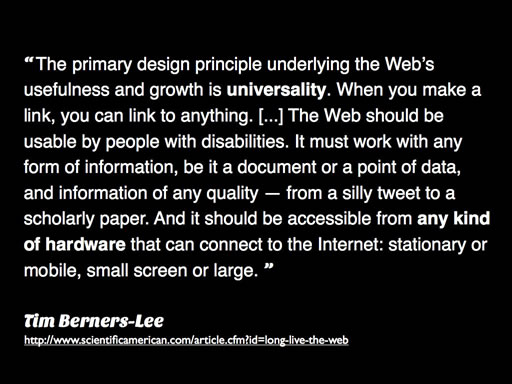
This next slide is a quote from Tim Berners-Lee about what he thinks the web "has always been".
It’s a rather long quote but what he's basically saying here is: "I agree with Tom".
(Obviously it’s nice to have a TBL quote in there. I’ve seen it used elsewhere in this context and I think it definitely supports what I'm saying. However it became clear when practising this (in front of my wife) that there really wouldn't be enough time for people to read it. It was only in attempting to work out how to get around that obvious mis-calculation that I decided that an ironically self-aggrandising summary of the quote might work. I don't know if it'll come out in the video but being aware that this worked much more like an actual "punch line" than anything else in the talk actually caused me to fluff it slightly, which is strange but definitely something to remember for next time).
So in conclusion I think it’s only by appreciating the way that web design is evolving, by understanding what it’s becoming and what it’s growing away from, can we start not only to redefine what web design is but also more importantly to rediscover what it has always been.
(One thing I learned from my previous attempt at this kind of thing was that you need to end with some kind of statement. Last time "I pulled a funny face, mumbled something about that being it, and quickly handed back the mike" which I didn't want to do this time. So I deliberately tried to come up with something which sounded final, so I could then say "the end" or something which would hopefully trigger polite applause. I can't remember exactly what I said now but I'm pleased that this seemed to work the way I intended. It’s nice to feel I learned something and have improved, even just a little).
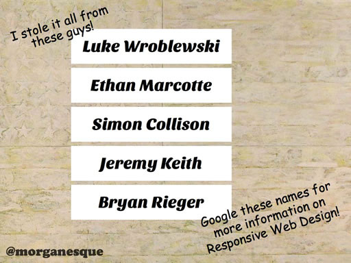
I didn't actually say anything over this final slide although I think my "conclusion" overran enough that it had popped up before I'd properly got to the end. I felt like I had to have these names included here as I'd drawn pretty much the whole talk from various things these guys have written or created over the last few years. It also seemed like, apart from some of the phrases I deliberately scattered through some of the other slides, these names would be the best place to start for anyone who was interested in finding out more.
A couple of final things to say. There could be a bit of dispute about whether what I described is actually Responsive Web Design or whether I'm actually describing something bigger which includes Responsive Web Design, Adaptive Web Design, the Mobile First philosophy and generally the Web Standards, Progressive Enhancement, One Web movements or ideas. I hoped by touching on as much as I could and then making a more general point I’ve managed not to stray too far form something that most people could accept was a current trend in web design (whatever you call it).
The other thing would be to address the idea that I’ve kind of conflated all of web design into one humongous whole which is all moving in one direction. I don't really think that but it’s hard in the restricted time of the format to get into too many subtleties. There's always going to be a number of different approaches to designing for the web (and a number of different purposes for websites) and I don't really believe in one ring to rule them all. I do think that Responsive Web Design is such a good idea, it makes so much sense, and it is so true to some of those unique attributes and aspirations of the web, that it is definitely going to be an important trend on the web in the future.
Personally I love it, I hope now you do too. ;-)
Finally I just wanted to say thank you to the wonderful people who put on Ignite (@imran, @smithylad & @lindabroughton). It was a really great event, I had a really good time. Thanks.

